ROLE: UX Researcher, UX Designer ORGANIZATION: The Urban Land Institute TIMELINE: June 2026 – December 2026 TOOLS: Microsoft Clarity, UserTesting METHODS: Usability testing, visual design audit, analytics review
Overview
A small button told a big story.
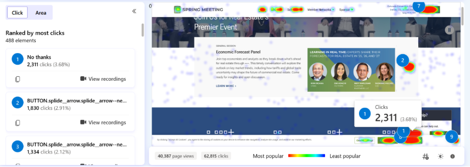
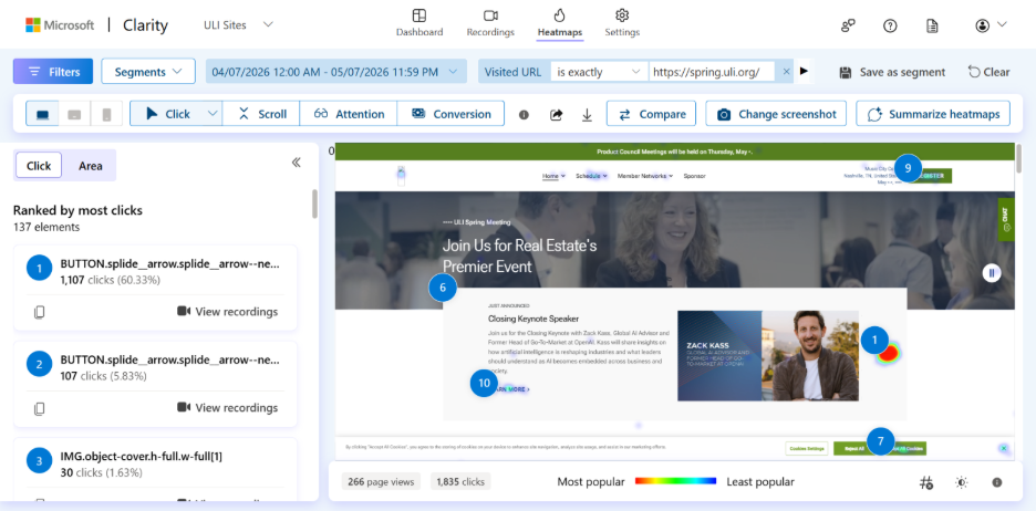
While reviewing Microsoft Clarity data for our major conference website, a pattern stood out immediately: over a 90-day period, the most-clicked element on the site’s homepage was the close button on the live chat widget. The chat wasn’t being used; it was being dismissed.
Rather than simply adjusting when the chat launched, I treated this as an opportunity to take a closer look at the chat experience as a whole.
Research
METHODS
I approached the research phase with two complementary methods:
A visual design audit and
An unmoderated usability test with seven participants
The user testing proved especially valuable, as it surfaced issues we hadn’t anticipated. While task completion rates were high, SEQ scores were noticeably lower, as usability gaps were quietly eroding trust.
"I feel like I was just abandoned."
-Test Participant
TEST RESULTS
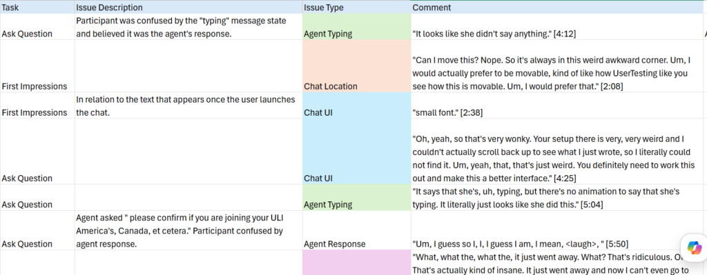
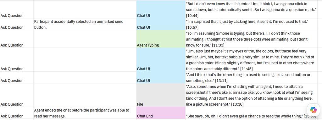
User testing surfaced several critical issues undermining trust and usability in the chat experience:
No visible “Send” button: Did not align with participant expectations for how to submit messages
Outdated visual design: Eroded participant confidence in the tool’s reliability
Abrupt session endings: Chats closed automatically when agents disconnected, causing participants to lose access to chat history
No file attachment capability: Did not meet a core expectation for support interactions
Broken download feature: Non-functional, contributing to participant dissatisfaction with agent interactions
No typing indicator: Left participants uncertain whether the agent was responding
The most striking finding: a 42% average satisfaction score towards agent response at baseline. The missing typing indicator emerged as a major driver. When agents took longer than 30 seconds to reply, the silence read as abandonment rather than processing, leaving users frustrated and distrustful.
Synthesis & Implementation
SYNTHESIS
To make sense of the usability test data, I used a spreadsheet to track the qualitative and quantitate data from the test. In addition to tracking core metrics such as time on task and the SEQ score for each task, I logged direct participant quotes and color-coded them by theme. This made it easy to see at a glance which issues were isolated versus systemic, and kept the participant voice close to the data throughout the analysis.
IMPLEMENTATION
With a clear picture of the issues, I partnered with an external contractor for implementation. The redesign addressed both the functional gaps and the visual experience.
Modernized the visual UI. Updated the overall aesthetic to feel current and on-brand, aligning the chat more closely with ULI’s visual identity. Redesigned message bubbles with distinct, accessible colors to clearly differentiate user and agent messages, and added a prominent Send button.
Fixed functional bugs. Resolved the broken download feature, prevented the session from ending instantaneously when an agent disconnected, and adjusted the chat trigger logic.
Followed established patterns and conventions. Updated the automatic messaging flow to better set expectations around agent availability and added a typing indicator to better inform the user of the system status.
Adjusted the chat trigger. By refining when and how it appears, we can make it more relevant to users’ needs, reduce unnecessary distractions, and increase the likelihood that users engage with it when they actually need assistance.
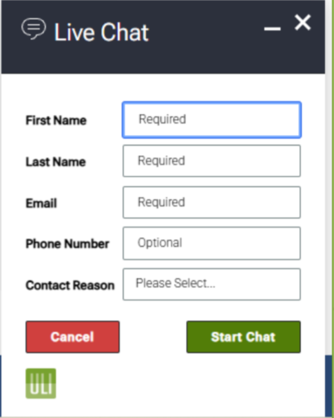
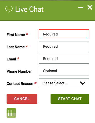
Previous Info Screen
Updated Info Screen
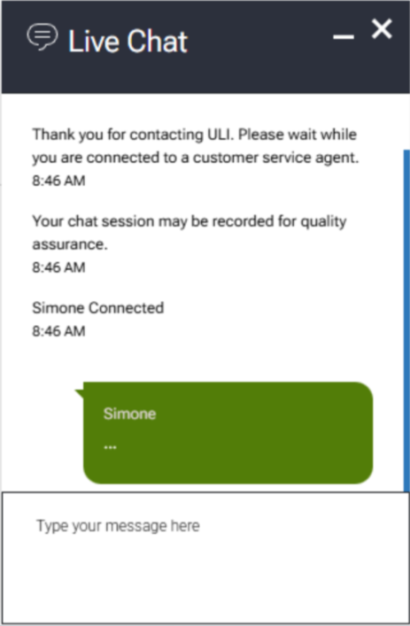
Previous Launched Chat
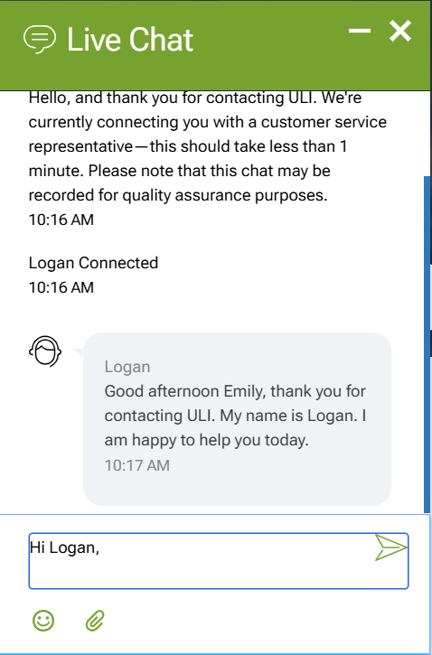
Updated Launched Chat
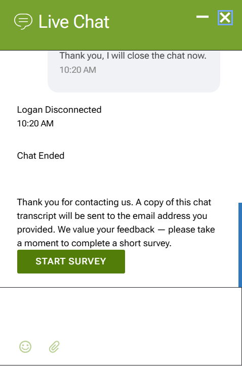
Previous Chat End
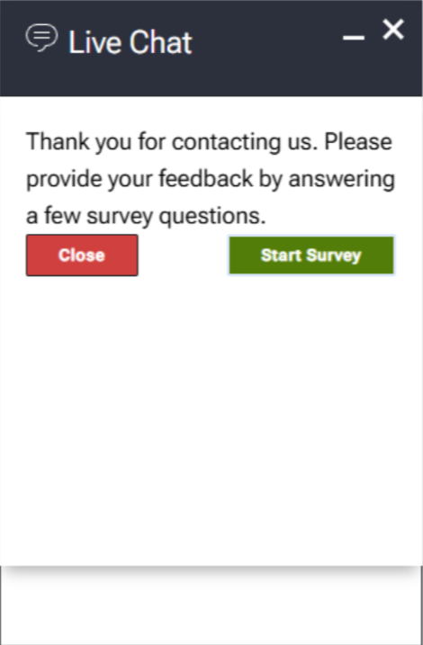
Updated Chat End
Outcomes
VALIDATION
Post-launch testing confirmed the redesign’s impact:
15% improvement in Single Ease Question (SEQ) average score
33% increase in user-reported sentiment toward agent response
It’s worth noting that the 33% improvement in agent sentiment wasn’t achieved through cosmetic changes alone. A significant portion came from fixing bugs and updating the automatic messaging — changes that made the interaction feel more reliable and set honest expectations before a conversation even began.
One year after the start of the project, I measured in the same seasonal window as the original Clarity review, and the live chat close button was no longer the most-clicked element on the site’s homepage.
REFLECTION
This project began with a single data point, an anomalous click, and grew into a meaningful redesign that touched both the visual and functional layers of the experience. It reinforced for me that analytics can tell you where to look, but user testing tells you why.
This project wasn’t without obstacles. I operated under a tight budget and significant technical limitations with the chat platform itself, which constrained what changes were feasible. Coordinating with a disorganized implementation partner added another layer of difficulty, requiring extra diligence to keep the project on track and ensure changes were implemented as intended.
The one-year Clarity check was a small but deliberate choice. I wanted to close the loop with the same metric that opened the investigation. Seeing the close button displaced from the top spot felt like a clean ending to a project that started with a hunch.