
Setting a Status on Slack
A 10 Minute UX Redesign
INTRODUCTION
Before we begin: I’m not affiliated with Slack in any capacity, and the views in this case study are purely my own. As I don’t have access to the data that influenced the current design, this case study is not fully comprehensive.
This case study was carried out with the goal of enhancing my learning experience and challenging myself to redesign a specific feature within the Slack app. As this case study is meant as a thought experiment based on the recognized laws of UX/UI design, it does not include qualitative research, its scope is inherently and recognizably limited.
I use the Slack mobile app almost every day. One of the features I use most to keep my team updated on my availability is the status – and after years of using this feature I keep experiencing the same issue.
Almost every time I set a status, I forget to confirm the update and exit without saving my status.
I asked myself the question – how can the current flow be redesigned to better suit the user?
THE CURRENT FLOW
The current process of setting a status doesn’t follow the Gutenberg Principle – the idea that “the eye moves from left to right along an axis of orientation until it reaches the bottom right corner…You should place your buttons at the end of the user’s scanning path when they’re ready to take action.
According to Anthony Tseng, the founder of UX Movement, “[p]lacing the call to action button at the top confuses users because they expect to see it after they finish scanning the content. A top button placement goes against a user’s natural scanning flow and veers them away from the path of completion…In addition to that, the small size combined with the awkward placement makes top buttons more difficult to find and slower to tap.”
After analyzing the flow with this in mind, I identified a few key issues:
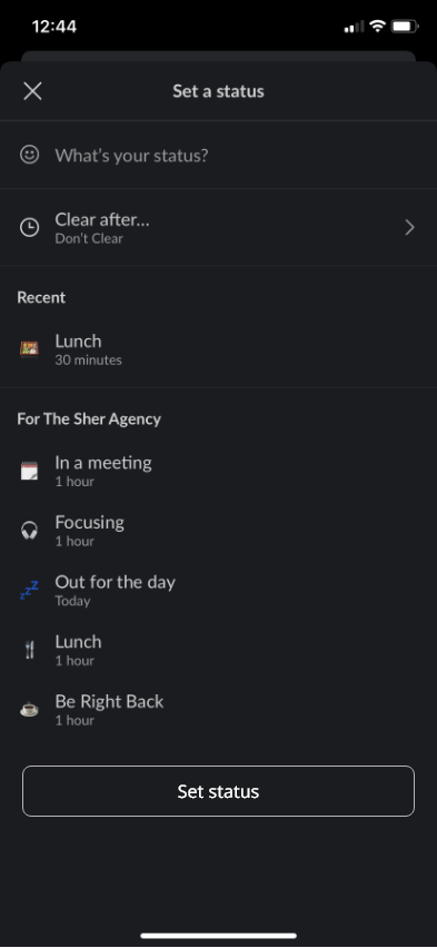
1. There is no inline indication of what a user has selected at their status
2. Once a user does select a status, it’s not immediately clear that they also have to confirm their selection before exiting as the only indicator is a slight color shift in the check mark in the upper right hand corner
3. The submit button sits at the top of the screen which breaks the logical flow of user action from the top to the bottom of the screen and is also outside of the thumb zone
4. Other key buttons on the app do follow the Gutenberg Principle – most importantly new message button. Top buttons are generally better suited for secondary actions, such as the “huddle” option within individual chats
UX SUGGESTIONS AND THE REDESIGN
To alleviate these hurdles to the user experience, I made 5 key adjustments:
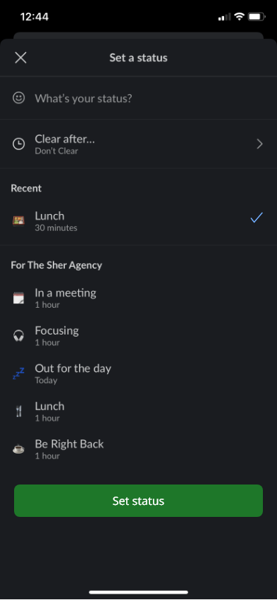
1. I shifted the confirmation of the user’s status – the checkmark – inline with the user’s chosen status
2. I moved the submit button below the user’s selected status, following the Gutenberg Principle
3. I made the submit button full-width to ease user selection, while still in keeping with the design of the buttons within the Slack app’s existing UI
4. I added text to the submit button – so the user would understand without a doubt what would occur when pressed
5. I created a more obvious action state due to the high contrast between the disabled and actionable state of the submit button – which prompts the user to complete the desired action
REFLECTION
This brief case study is in no way meant as a criticism of the current Slack interface – it’s an app I love that I use almost every day.
Rather, it’s meant to be an exploration of how small changes can have a big impact on the overall user experience, and how valuable the analysis of an interface through the lens of the tried-and-true laws and principles of UX can be.
Thank you for reading!