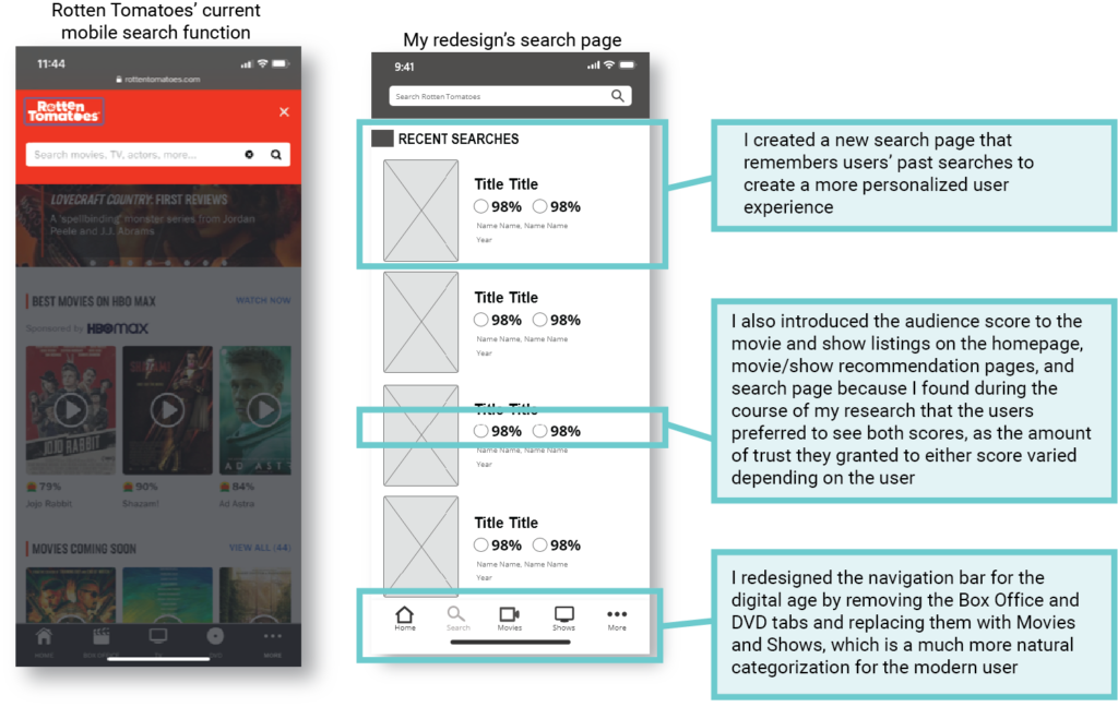
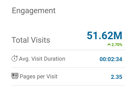
Rotten Tomatoes

Rethinking the Rotten Tomatoes mobile experience

I watch A LOT of movies and shows – and I’m on Rotten Tomatoes at least a few times a week. When I use the mobile site, I find myself getting frustrated as I attempt to wade through the sea of content to access what matters to me most – the Tomatometer score and critic reviews. 

So I asked myself the question – does the current mobile site cater to the Pareto principle?

The Pareto principle states that, for many events, roughly 80% of the effects come from 20% of the causes.

ROLE: User Researcher, UX/UI Designer 
TIMELINE: July 2020 – August 2020
TOOLS: Survey Monkey, Pen and paper, Adobe XD, Zoom
TEAM: Emily Howard (User research, UX/UI design), KJ Johnson (User research assistant)

Research

I hopped on an analytics website to see if I could find some more insight into my questions:

rotten tomatoes analytics
Analytics taken from similarweb.com (8/8/2020)

With an average visit of only 2:26, and only 2.35 pages visited per visit, I hypothesized that most users followed the same pattern I did: searching for a specific movie/show to check the ratings and reviews. 

SURVEY

I wanted to dig further, so I conducted a survey of Rotten Tomatoes users to discover their usage patterns and what features they used the most:

What features do you use on Rotten Tomotoes?
rotten tomatoes survey
What do you use to access Rotten Tomatoes?

⭐KEY TAKEAWAYS:


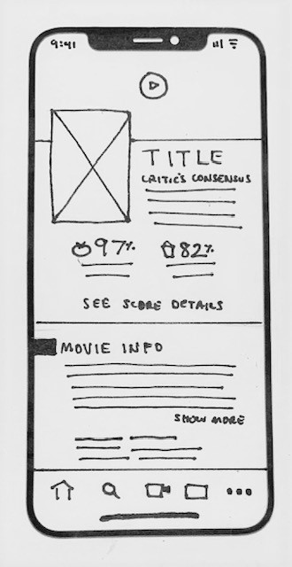
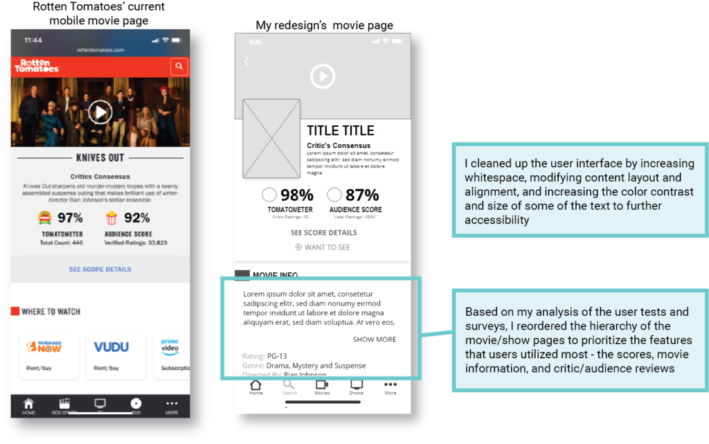
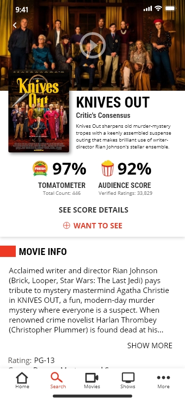
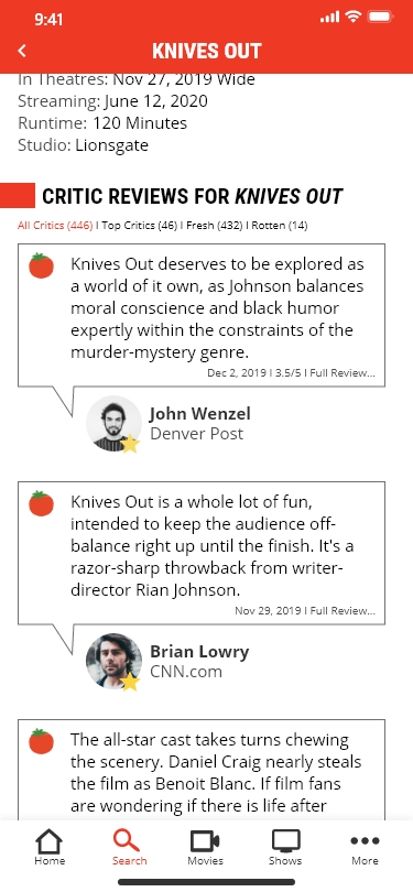
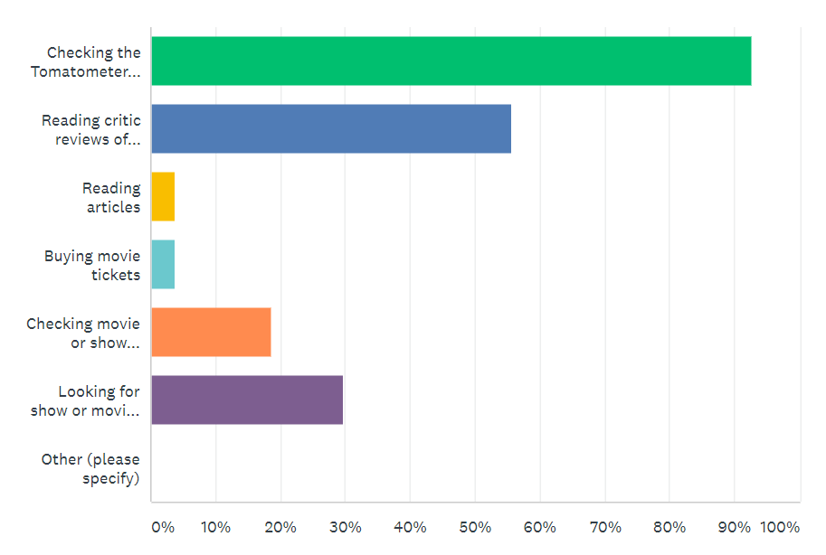
Over 90% of respondents said they referenced the Tomatometer score, 50% said they read critic reviews, and 30% responded finding show and movie recommendations. 


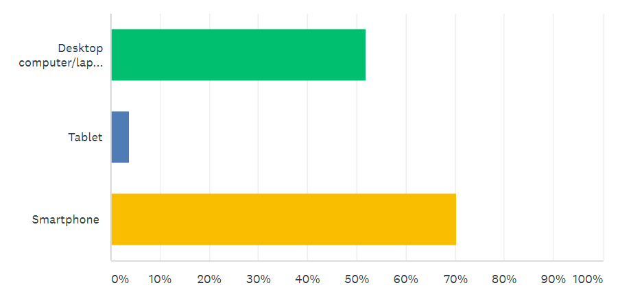
When asked what feature they would miss the most if unable to use Rotten Tomatoes, 60% said the Tomatometer, 30% said critic reviews, and 12% said recommendations.

USER TESTS

Next, a research assistant and I led 5 user tests to better understand the current user experience on the Rotten Tomatoes mobile site. 

Although the users felt overall that the experience was straightforward and the website was user friendly, I did identify two key pain points: 

⭐ THE NAVIGATION: The navigation bar options were not well understood and outdated in the age of streaming

I don't really deal with DVDs anymore...because everything is streaming now.

⭐ THE HEIRARCHY: The hierarchy of the movie and show pages was not suited to meet the key user goals

You might be lazy and don’t want to scroll down that far.

[The site] placed a lot of emphasis on steering you towards other things instead of what you were looking for…I want to see what I’m looking for and not anything else.

Analysis

From the analysis of both the user tests and surveys, I discovered that my hypothesis was correct – a large majority of the time users were searching for specific movies and shows to determine whether or not they were worth the watch. The largest determinants the users utilized to determine the quality of the show were the show ratings and reviews. This was Rotten Tomatoes 20%! 

Much of the content on the movie pages was extraneous to users accessing the content they really wanted to see – as one user put it, content only “superfans” might be interested in.

The current mobile Rotten Tomatoes experience wasn’t catering to the Pareto principle – what was I going to do about it? 

I moved into the design phase asking myself this question:

How might I design a Rotten Tomatoes app that allows users to more easily access the content and features that they use most often?

Design

SKETCHING

Keeping my key question in mind, I started sketching and drew several iterations until I felt confident I had come up with a solid model for moving forward:

homepage sketch
Landing page
Search page
Movie page

WIREFRAMES

homepage wireframe
search wireframe

THE BIG REVEAL

After weeks of research, analysis, and design, it was time to put it all together! Below are screengrabs from my high-fidelity prototype, created in Adobe XD.

I moved the movie info and critic/audience reviews just below the scores to reduce the amount of scrolling users were forced to do. Other features are still easily accessible to “superfans,” but not to the detriment of the average Rotten Tomatoes user. 

I included some of my favorite movies on the search page – do we have any in common?? 

Reflection

This project was a lesson in restrained design. During the course of my user research, I found that outside of a handful of criticisms and frustrations, users were largely content with the current user experience on the mobile Rotten Tomatoes website. 

Therefore, the framing of the project through the Pareto principle became crucial. Once I discovered Rotten Tomatoes’s 20%, I was able to devise how to better present those features for a more user focused experience that better accommodated user goals.
Small changes, that put together over time, make a big impact on the user experience.

You can check out my high-fidelity prototype here.